01 / The vision
A welcome that starts online.
I’m Levin, the designer behind Design Acquire. It’s my independent practice, and I work directly with my clients throughout a project. For Tiffany Village and Kenny’s Pond, that meant taking the time to understand the residences, working closely with Kristen and her team, and carrying that understanding from the first design ideas into the finished websites.
Choosing a retirement residence reaches into almost every part of a person’s life. Their independence. Their routines. Their relationships. The place they will wake up each morning, and the support they may need as life changes.
For a family helping someone they love, the decision carries its own questions. Will they be comfortable? Will they feel at home? What kind of help is available? What happens if their needs change? How do we even begin?
I wanted the websites for Tiffany Village and Kenny’s Pond to meet people at that moment with warmth, clarity, and a sense of possibility.
My ambition was to create an online experience that felt as considered as the welcome someone would receive in person. Beautiful enough to make people want to explore. Clear enough to help them understand the care. Practical enough to help them take the next step.
The insight that shaped the direction
For me, the direction began with a visit.
After touring the residence with Kristen, I kept coming back to one thought: exploring this place online should carry the same sense of quality and hospitality as considering a beautiful hotel. The spaces, the atmosphere, the dining, and the attention given to everyday life all deserved to be felt through the website.
That visit gave me a useful design standard. The digital experience needed to communicate what it was like to be there.
In the category references I reviewed for the presentation, I saw an opportunity. Important care information could be difficult to find. Amenities were often explained through dense text. Generic icons did little to express the character of an individual residence.
I saw room for a more distinctive, more visual, and more helpful approach. One that gave people a clear understanding of the care while also showing the life surrounding it.
The question I wanted the design to answer was this: how could I make an emotionally significant decision easier to explore, while presenting the residences with the quality they deserved?
Three principles behind the experience
I organised the concept around three connected principles.
Create a premium hospitality experience. Photography, typography, spacing, and pacing would help visitors appreciate the surroundings and imagine themselves there. Every page needed room to breathe, with a clear relationship between atmosphere and information.
Make care the hero. The care offering would be visible from the first screen and early in the page journey. Visitors should be able to find the options that matter to them without working through unrelated content first.
Give care a recognisable identity. Each care option would have its own symbol and meaning, with a visual language that could continue across the website, advertising concepts, and printed materials.
Together, these principles connected the emotional and practical sides of the decision. A visitor could feel drawn to the place and understand how it might meet their needs.
These principles gave me a consistent way to judge my design decisions. A beautiful section needed to tell a useful part of the story. A functional section needed to feel like it belonged to the same welcoming experience.
02 / Care identities
Making care recognisable.
A distinct identity for each care option
One of my most consequential design decisions was to treat the care offering as a brand experience in its own right.
I developed a family of four nautical symbols, each tied to a different kind of support. Their meaning gave the care options an emotional dimension while the accompanying labels kept the information explicit.




The sailboat places independence at the centre of the story. It suggests a life with direction and possibility, with the resident continuing to make choices about their own day.
The compass expresses help without taking away agency. It gives assisted living a positive and respectful identity: support that helps someone keep moving through life with confidence.
The anchor offers a way to talk about memory care through connection and familiarity. Its meaning reaches beyond a service description to the importance of feeling grounded in a place and among people who know you.
The lighthouse provides a sensitive identity for end-of-life care. It represents a steady presence, with comfort and dignity at the centre.
The symbols were also drawn into the wider identity through their framing. Alongside simple circular versions, the more detailed borders echoed elements of the existing Tiffany Village and Kenny’s Pond logos. That relationship helped the new care identities feel connected to the established brands.
The resulting system gave each care option a consistent visual marker. A person could encounter the sailboat in an independent living concept, find it again on the relevant webpage, and recognise it on a brochure.
That repeated association was designed to make the journey easier to follow. It also gave the organisations a distinctive visual language they could keep using as their communications developed.
03 / The journey
From first discovery to the kitchen table.
Planning the journey beyond the website
I approached the project as a connected experience with the website at its centre.
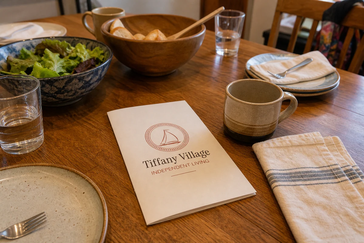
A family’s decision can continue through several conversations, multiple visits to a website, an in-person tour, and a brochure left on the kitchen table. The design needed to account for those moments.
To make that thinking concrete, I presented a specific journey for someone interested in independent living.
First, an advertisement introduces the offering with the sailboat symbol and a relevant message. Its purpose is to create a clear expectation about the care option being presented.
The visitor then arrives on a dedicated independent living page. The same symbol, tone, and visual language continue there, helping the destination feel familiar. The page explains the offering and gives the visitor ways to explore the surrounding lifestyle.
As interest grows, the website provides a route to a conversation and a private tour. The transition into personal contact is part of the experience: someone should understand who they can speak with and what that conversation can help them resolve.
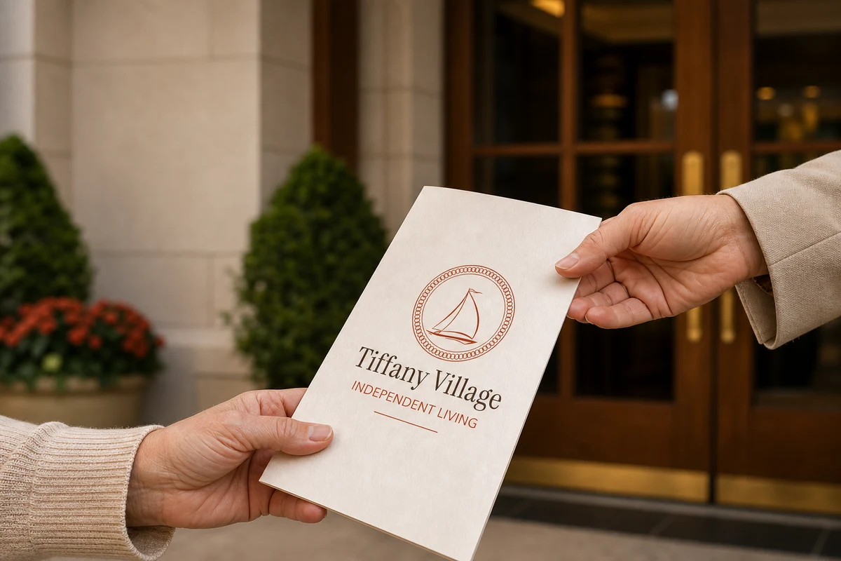
The proposed in-person handoff continues the same idea. A visitor interested in independent living receives a relevant brochure using the identity they have already encountered. The material can help the team reinforce the information that matters to that person.
Finally, the brochure goes home. It becomes part of the family’s discussion and a reference they can return to, with a clear connection back to the website.
I deliberately carried the concept through to that kitchen-table moment. I wanted the experience to remain coherent when people were comparing options, talking with relatives, and thinking privately about what came next.
This planning also gave the marketing a more purposeful structure. A campaign for a particular care option could lead to a page about that option, with matching material available for the conversation that followed.
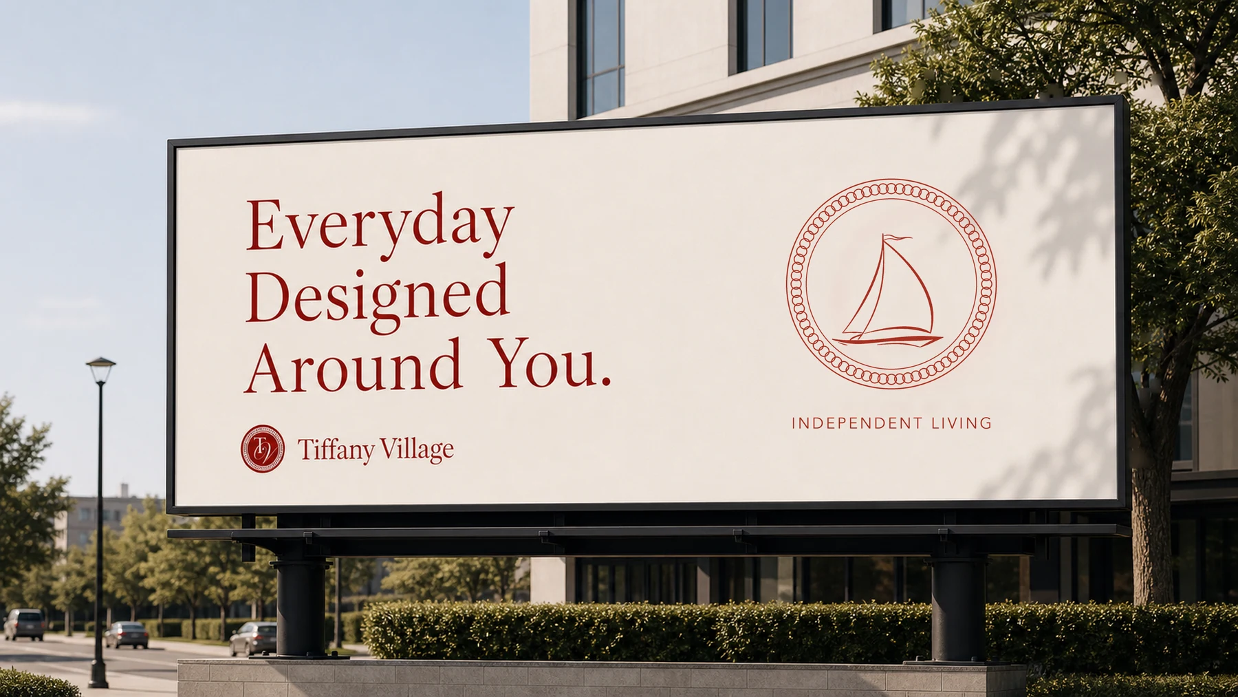
- 01Discover
A relevant care message.
- 02Explore
A dedicated care page.
- 03Connect
A conversation and tour.
- 04Consider
A brochure to take home.
Designing for residents and the people supporting them
The website needed to support more than one perspective.
For a prospective resident, the important questions might concern independence, privacy, comfort, friendships, meals, and everyday routines. The design needed to help them imagine a life they would want to live.
For an adult child or another family member, the priorities might include available support, changing care needs, practical arrangements, cost, and the ability to speak to someone who could help.
I planned for both perspectives without making either one disappear.
The lifestyle content gives residents space to picture their own day. The care pages and practical information give families a clearer basis for discussion. The contact routes keep a human conversation close at hand.
I also allowed for different levels of readiness. Someone planning well ahead can browse suites, neighbourhoods, and amenities. Someone with an immediate question can find a care option and contact the team directly.
This is where journey planning influenced the structure of the site. Visitors are given several useful ways forward, depending on the question they are trying to answer.
04 / The websites
Two residences. Their own sense of place.
Two residences with their own character
Tiffany Village and Kenny’s Pond share a related care offering, but each has a distinct setting and personality.
I brought the two residences together through a common structure: recognisable care symbols, a consistent approach to navigation, clear content hierarchy, and a focus on the resident’s experience.
Each residence then expresses that structure in its own way.
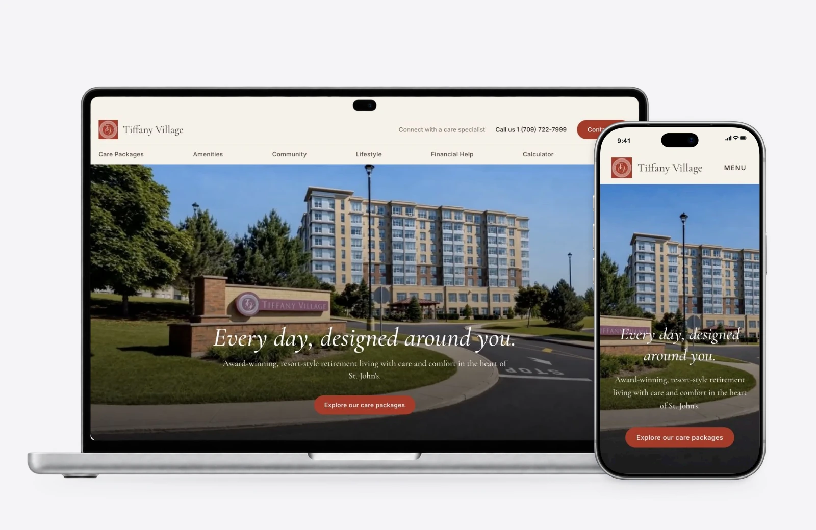
Tiffany Village uses warm tones, red accents, soft neutral backgrounds, and deep navy sections. Its presentation carries a sense of established hospitality, with elegant typography and generous imagery.
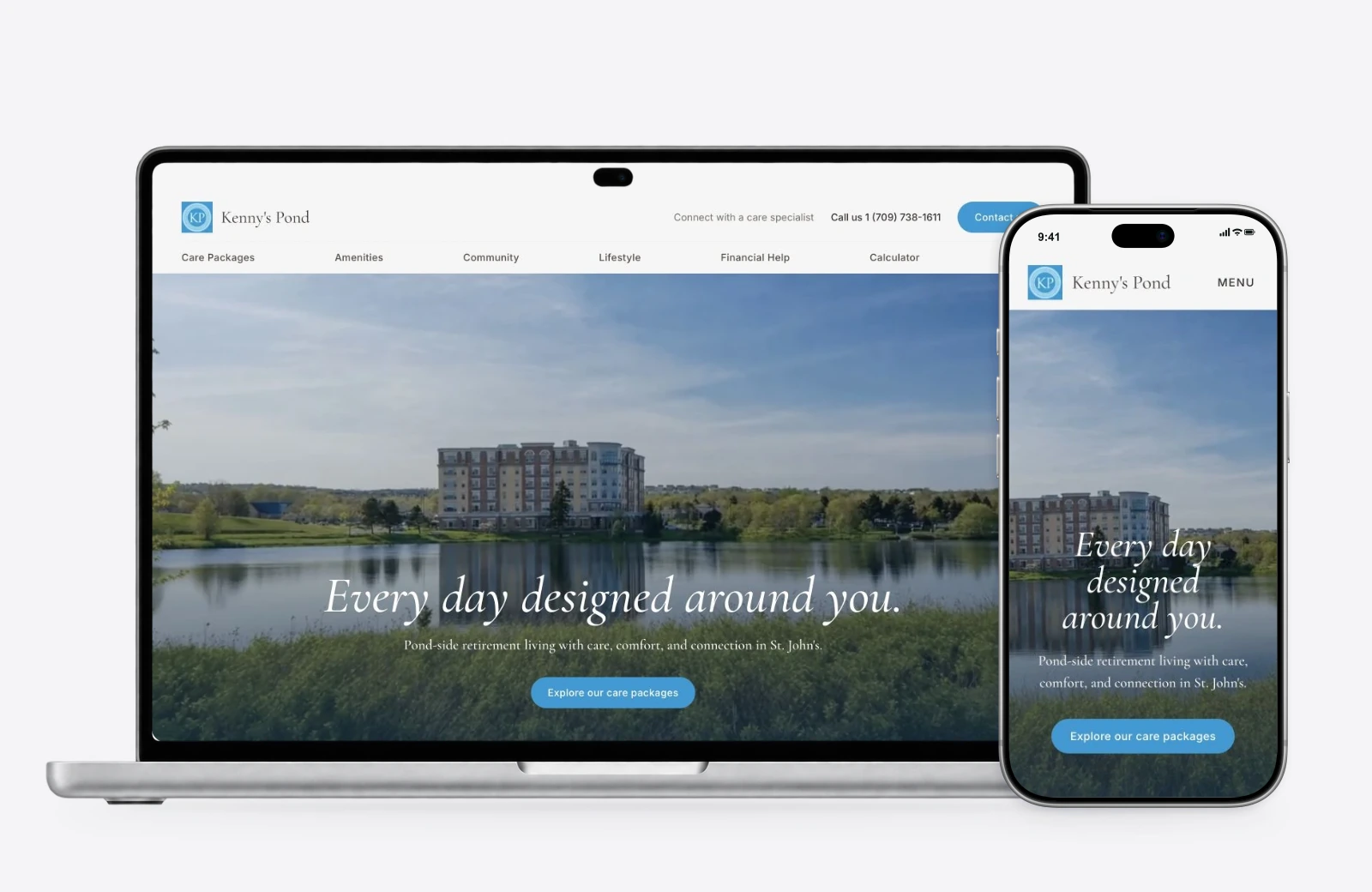
Kenny’s Pond draws on its blue identity and waterside setting. Views of the pond, surrounding greenery, suites, and shared spaces make the location an active part of its story.
This gave the two websites a family resemblance while leaving room for the qualities that make each residence worth considering.
For the organisations, the shared approach also creates a useful foundation. Care categories and page patterns can remain consistent while photographs, local details, and brand expression stay specific to the residence.
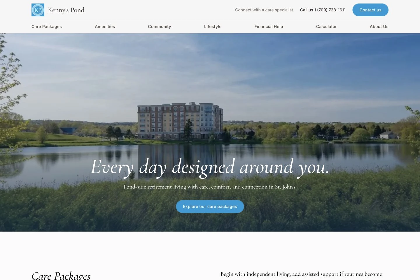
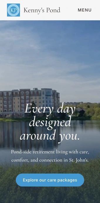
Turning the first impression into an invitation
The opening screen had an important job: establish a sense of place and make the next step immediately understandable.
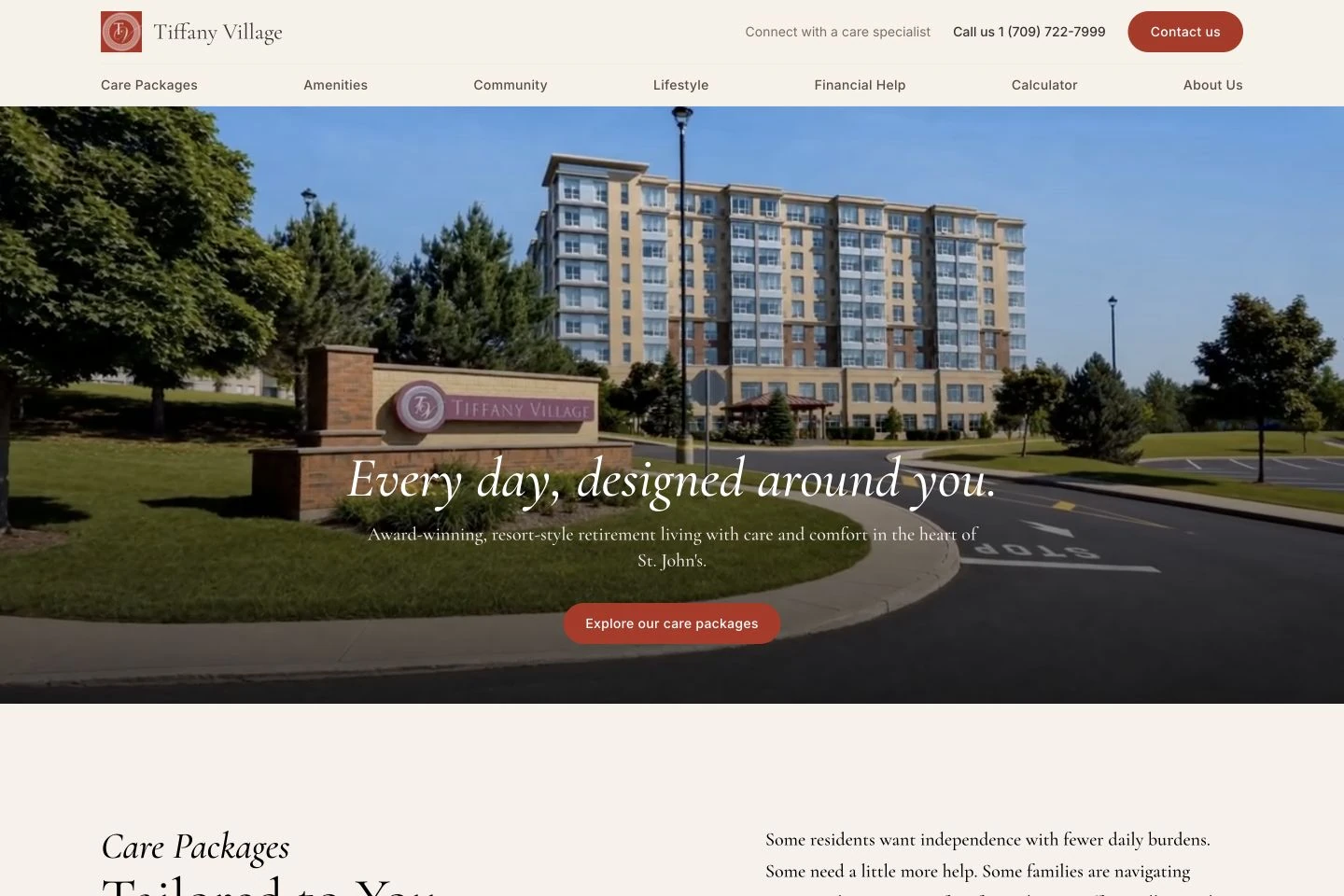
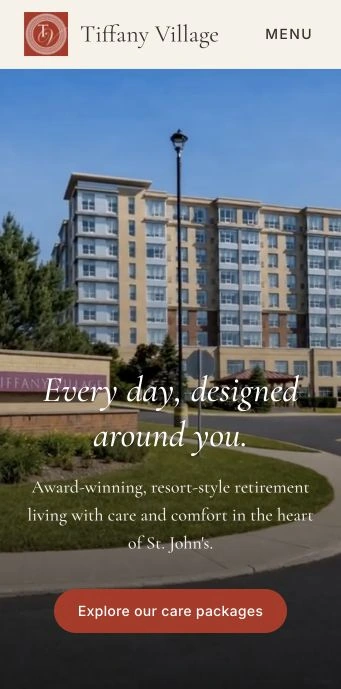
Large hero imagery gives each residence a confident introduction. The buildings and surroundings occupy the screen, with concise messaging and a clear invitation to explore the care packages.
At Tiffany Village, the line “Every day, designed around you” expresses the organising idea of the experience. It places the person and their daily life at the centre of the offer.
The navigation then makes the practical structure visible. Care packages, amenities, community, lifestyle, financial help, and the calculator are easy to identify. Contact details and an invitation to speak with a care specialist sit prominently above them.
I wanted the first impression to do both jobs: introduce the atmosphere and show visitors where to find useful information.
Making contact obvious and building trust
One of my clearest UX goals was to make the next step unmistakable: contact the residence. I placed three contact calls to action in the navigation alone, with the phone number and contact information given a prominent position. Each reinforces the same invitation to speak with someone. Visitors can explore at their own pace, with a clear way to start a conversation when they are ready.
That visibility also serves an emotional purpose. For an adult child considering a residence for an ageing parent, being able to stay connected matters. Alongside questions about care and daily life sits another concern: “If I need to check on Mum or Dad, will I know who to call?” Prominent contact information gives them a clear point of contact at the residence and helps them picture staying in touch after the move.
I wanted the design to build confidence in both deliberate and quieter ways. Someone actively looking for the phone number can find it immediately. Someone still exploring can register the same reassuring message: there are people here I can reach. That sense of openness was part of the trust I wanted the website to establish before the first conversation.
Making contact prominent therefore supported two connected goals: encourage enquiries by making the desired action clear, and reassure families that communication with the residence is easy to begin.

05 / AI and imagery
Helping people picture being there.
Using AI to bring the hero imagery to life
I used AI as part of my creative production process for the websites.
I created moving video treatments for the hero sections with AI and used it to improve the quality of images throughout the experience. This gave me another way to express the character of the properties and make the opening moments feel more alive.
The motion helps the opening feel immersive. The building and its surroundings have a sense of movement and presence, giving visitors a more atmospheric introduction to the residence.
That creative choice supports the original hospitality direction. An opening image can establish what a place looks like; a carefully considered moving sequence can add a sense of arrival.
The image work served a related purpose. The design relies on generous photographs, and large image areas make visual quality especially noticeable. Improving the images helped them sit more confidently within the layouts and supported a more consistent presentation.
I directed that work alongside the composition, image selection, typography, colour, and content hierarchy. Each decision gave the generated motion and enhanced imagery a clear role in the finished experience.
The sites also illustrate why presentation context matters. Tiffany Village’s current website labels renovation previews, keeping those future-facing visuals distinct from the photographs of existing spaces.
The value of the AI work is visible in the creative result: richer opening imagery and a stronger visual foundation for telling the story of each residence.
Showing what everyday life could feel like
From the original presentation, I wanted the experience to be highly visual. People needed to see enough of the residences to start imagining a day there.
I gave shared spaces, dining, suites, activities, and the surrounding neighbourhood enough space to become part of the story.
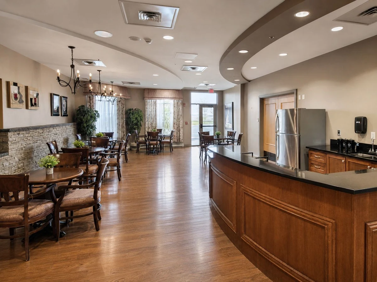
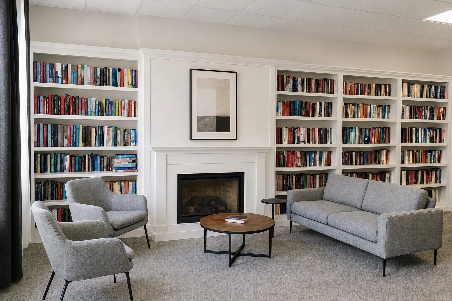
A library becomes a place to spend a quiet afternoon. A dining room suggests the pleasure and convenience of sitting down to a meal. A lounge offers somewhere to read, talk, or welcome family. The pond and walking trails help visitors imagine routines that extend beyond their suite.
Photography makes those possibilities tangible.
The layouts combine large images, galleries, and more intimate compositions. Arched image treatments add softness and a recognisable detail, while broad image sections give important spaces a stronger presence.
There is also a deliberate rhythm between these moments. A spacious introduction can lead into a clear set of care options, followed by a richer picture of daily life and then practical information.
That rhythm lets the experience unfold in stages. Visitors can form an impression, find the care information they need, and continue exploring at their own pace.

The renovation collection
Visualising the next chapter.
I also created renovation previews to help people picture how refreshed interiors could feel. From dining and music to a quiet moment with a book, these visuals make the ideas for each space easier to imagine.
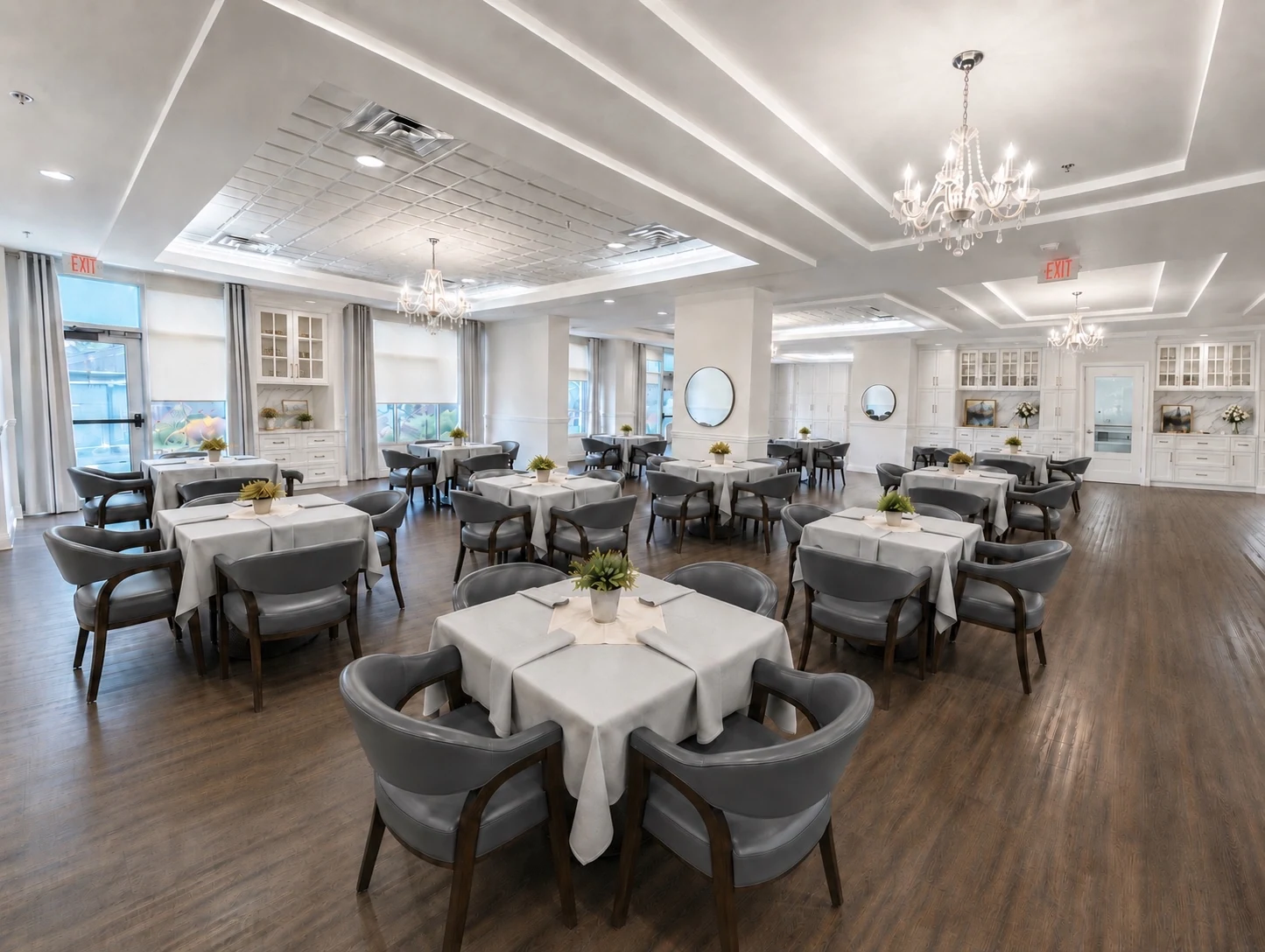 Renovation preview
Tiffany Village · Visual concepts for the renovated spaces.
06 / The details
Atmosphere, with answers.
Typography and spacing that support the story
I used expressive serif typography to bring warmth and elegance to the experience, supported by straightforward navigation and interface text.
The contrast helps different kinds of information do their jobs. Large headings introduce a feeling or a subject. Smaller labels organise the page. Body copy explains the details. Buttons identify the next action.
Spacing is part of that hierarchy.
Sections have room around them, and the design gives important images and ideas a clear place to land. The intention is to make a substantial amount of information feel manageable and considered.
Colour also helps establish rhythm. Light backgrounds support reading and exploration. Stronger brand-colour sections mark changes in subject and give lifestyle content a more immersive setting.
The result is a visual language that can carry both aspiration and detail. It has enough character to make the residences memorable, with enough structure to help visitors understand what they are seeing.
Practical tools that help people move forward
A compelling impression needed practical support behind it.
The websites bring together dedicated care pages, suite information, lifestyle content, neighbourhood exploration, cost estimators, financial-help information, and contact routes. Each addresses a different part of the decision.
The care pages give people a focused place to explore a particular option. Someone interested in independent living can learn about that offering without having to interpret the entire care system at once.
Suite and amenities content helps make the living arrangements more concrete. Visitors can explore the spaces and features that would shape their day.
The neighbourhood maps place the residences in the wider context of St. John’s. Nearby cafés, shops, parks, and services become part of the experience. This supports an important message: moving to a residence can still mean staying connected to familiar places and routines.
The cost estimators provide an initial way to explore monthly costs through choices such as suite type, meals, and care level. The displayed ranges are identified as estimates, with the care team available to confirm the details.
Financial-help information belongs alongside that exploration. Its purpose is to make the conversation easier to start and to show where a visitor can seek guidance about possible support.
The contact and tour invitations then connect this information to a person. The website can help visitors prepare, while the team can help them understand their individual situation.
Explore those decision-support features on Tiffany Village and Kenny’s Pond.
Writing that connects services to daily life
My copy direction followed the same person-centred approach as the design.
I wanted the content to help people understand what an offering could mean in their own lives. Independence, support, comfort, familiarity, and connection give the information a human context.
That changes how a service is introduced. Dining can be explained through the ease of having meals prepared and the pleasure of sharing a table. Housekeeping can be connected to having fewer daily tasks to manage. Shared spaces can be presented through the routines and relationships they make possible.
Care information still needs to be clear. The writing brings those practical details into a reassuring conversation, with the resident’s dignity and choices kept in view.
The same approach extends to calls to action. Exploring care packages, speaking with a specialist, and arranging a tour are meaningful next steps that match different stages of readiness.
Together, the copy and interface give visitors ways to continue without assuming that everyone is ready to make the same decision at the same time.
Carrying the experience onto mobile
I designed dedicated desktop and mobile layouts.
That mattered because the same decision may be explored in different circumstances: a longer research session at a desk, a page opened on a phone, or a link shared during a conversation with family.
On smaller screens, the hierarchy still needs to hold. Visitors should be able to recognise the residence, understand the care options, explore the content, and find a way to make contact.
The mobile direction carries forward the same imagery, care identities, and visual character, with layouts arranged for the narrower format.
Treating mobile as part of the design system helped keep the experience connected across the devices people may use during their research.
A design foundation for future communications
I also wanted to leave the residences with a design foundation that extended beyond the individual screens.
The final design file includes foundations for colour, typography, grids, and spacing, along with components for navigation, content, forms, calculators, media, and maps. Desktop and mobile page designs carry the system across both residences.
This creates a practical foundation for continued work. The residence teams have an established way to present a care option, introduce an amenity, show a photograph, or guide someone toward contact.
The care symbols add continuity beyond the interface. The original concept demonstrated how the same visual language could support advertisements, brochures, and the materials used during a tour.
That wider thinking is valuable because a brand is experienced through repeated encounters. A consistent system gives future communications a starting point and helps each new piece feel connected to the rest.
07 / The outcomes
Designed for a more confident next step.
The business outcomes I designed for
My work had a clear commercial purpose: help the right people understand the residences, recognise their value, and contact the care team. Making that next step obvious was a central UX goal, alongside building the confidence families need to take it.
I designed the experience to support that purpose through several connected objectives.
Communicate the quality of the offering. A more considered visual presentation was intended to bring the digital impression closer to the quality experienced during a visit. The photography, motion, and design system make the surroundings and care offering more visible.
Make contacting the residence the obvious next step. Three contact calls to action in the navigation alone, supported by prominent phone and contact details, make the intended action clear. I wanted interested visitors to know immediately how to start a conversation, ask a question, or arrange a tour.
Build confidence through visible availability. For adult children exploring a residence for a parent, clear contact information provides a reassuring point of connection. I wanted families to feel confident that they would know how to reach the residence when they wanted to check in. The same design decision supports an immediate enquiry and the quieter trust that begins before someone chooses to call.
Help visitors arrive better informed. Practical information about care, suites, daily life, costs, and the neighbourhood gives families more to consider before contacting the team. The aim is to support conversations that can focus more closely on the person’s needs.
Support more focused marketing. The care identities and dedicated pages give future campaigns a coherent route from a specific message to relevant information. The same approach can carry into printed materials.
Make the value easier to understand. Lifestyle storytelling shows how the spaces and services fit together. It gives visitors a fuller basis for considering what a residence offers.
Build a consistent foundation across two brands. Shared patterns and distinct brand treatments help the residences communicate with a related standard of clarity and quality.
These are the business outcomes I designed the experience to support. The completed work gives the organisations concrete tools for pursuing them.
The finished experience
The finished websites bring the strategy into a clear and recognisable form.
Both residences have a strong visual introduction, a prominent care offering, dedicated information for different interests, and practical routes toward personal contact.
The nautical care identities give the experience continuity. The imagery gives it atmosphere. The typography and spacing give the content room to be understood. The maps, estimators, and supporting pages give visitors useful ways to explore the decision.
Tiffany Village’s warm palette and refined presentation express its hospitality. Kenny’s Pond’s blue identity and waterside imagery make its setting central to the experience.
What I’m most proud of is the relationship between what people see, what they learn, and what they can do next. The atmosphere draws them in, the care information gives that interest substance, and the practical tools help them move toward a conversation.
They make a strong case for visiting by helping people begin to picture the life on offer.
08 / The partnership
Good work starts with understanding.
A close working relationship
Working with Kristen and her team was central to this project. I took the time to listen, understand the organisation, and learn about the experiences of the residents it serves. That understanding informed the decisions I made, from the emphasis on care to the way everyday life appears throughout the websites.
I continued to refine the designs and marketing materials with their vision in mind. The care identities, website layouts, and wider journey all needed to feel right for the people and places they represented.
This is how I want clients to experience Design Acquire: a close working relationship with the person shaping their website. You can talk directly with me about your ideas, ask why I’ve taken a particular direction, and work through the details together. I bring my design judgement; you bring the knowledge of your business that gives the work its depth.
The client’s perspective
“Levin was exceptionally professional, responsive, and efficient throughout the website development and marketing materials project. He took the time to listen, understand our organization, and fully immerse himself in both our work and the experiences of the residents we serve. His commitment to continuous improvement was evident as he consistently refined and enhanced our materials to ensure they remained resident-focused and aligned with our vision.”
Kristen Parsons
President, Seniors Living
Tiffany Village & Kenny’s Pond
Why this project matters
This project brought together the parts of design I care most about: understanding a business, finding the idea that makes its offering clearer, and carrying that idea through the details people actually encounter.
Its strongest idea was simple: care should be visible in the way the organisation presents itself.
That meant giving care options clear identities. Showing daily life with warmth and specificity. Planning for the conversation after the click. Thinking about the brochure a family takes home. Using new creative tools where they could strengthen the presentation.
Every one of those decisions served the same purpose: help people approach an important next chapter with a clearer picture of what could be possible. Working closely with the client kept that purpose at the centre of my work.
For Tiffany Village and Kenny’s Pond, the website becomes the beginning of the welcome.